Everything is designed. Few things are designed well.
- Brian Reed
- Brian Reed
Contact
You can always reach me at jslavuter@gmail.com, promise.
You can always reach me at jslavuter@gmail.com, promise.

Thousands of brands and enterprise marketers use Conductor’s cloud-based SEO platform to manage their search visibility and the performance of their web content. When it comes to enterprise reporting, our users needed a quick and easy way to view reporting insights for multiple brands across different search engines, locations, and devices.
Create a comparison reporting tool to help users in two ways:
| Timeline |
|---|
| 3 months |
| Tools |
|---|
| Zendesk, Airtable, Sketch, Zeplin, and Gong |
| Activities |
|---|
| Research, Conceptual Design, Validation Testing, Detail Design, Usability Testing, and Documentation |
How do you prioritize your SEO and content marketing efforts for multiple brands with individual websites, accessed by millions of users across different search engines, locations, and devices?
Tools used:
Assessing pain points in the workflow. It starts with the user. Configuring and saving lots of similar reports is a very time-consuming and repetitive process. We started by conducting several user inquiries and scouring through product feedback. Our findings were that users had two major pain-points that we needed to address:
Tools used:
Working with the product manager, I outlined a two-pronged approach to meet our users needs:
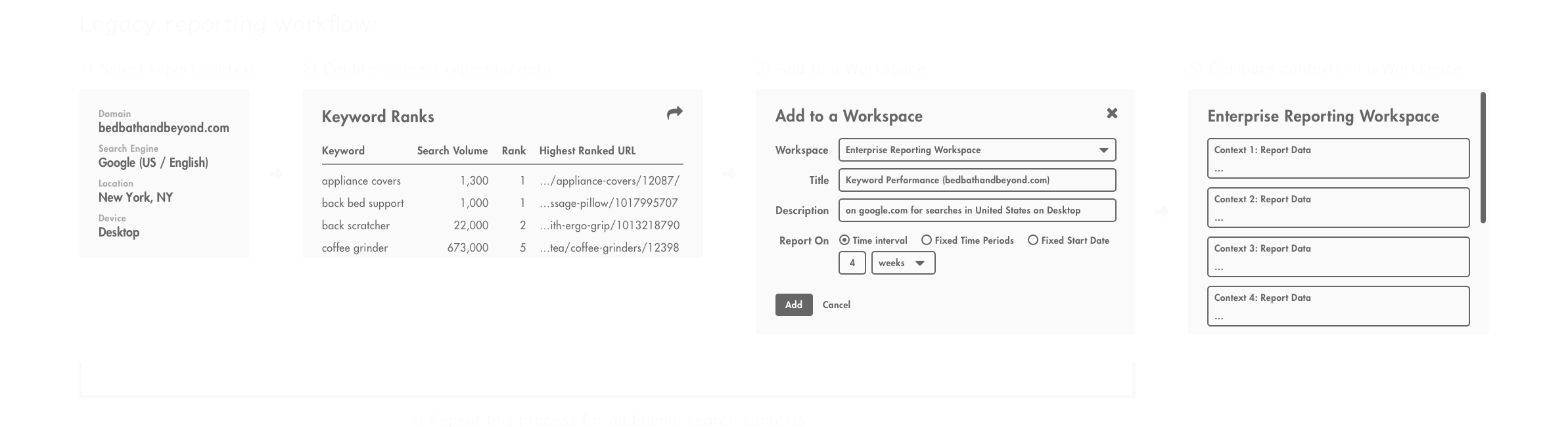
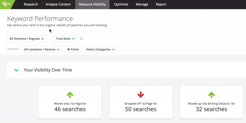
1) We could enhance the primary Keyword Performance feature to support multiple context reporting. This feature allows customers to deep dive into analysis on the visibility of individual keywords they're tracking for their website. By adding multiple context reporting, enterprise users would be able to aggregate and filter their visibility data across a range of dimensions.
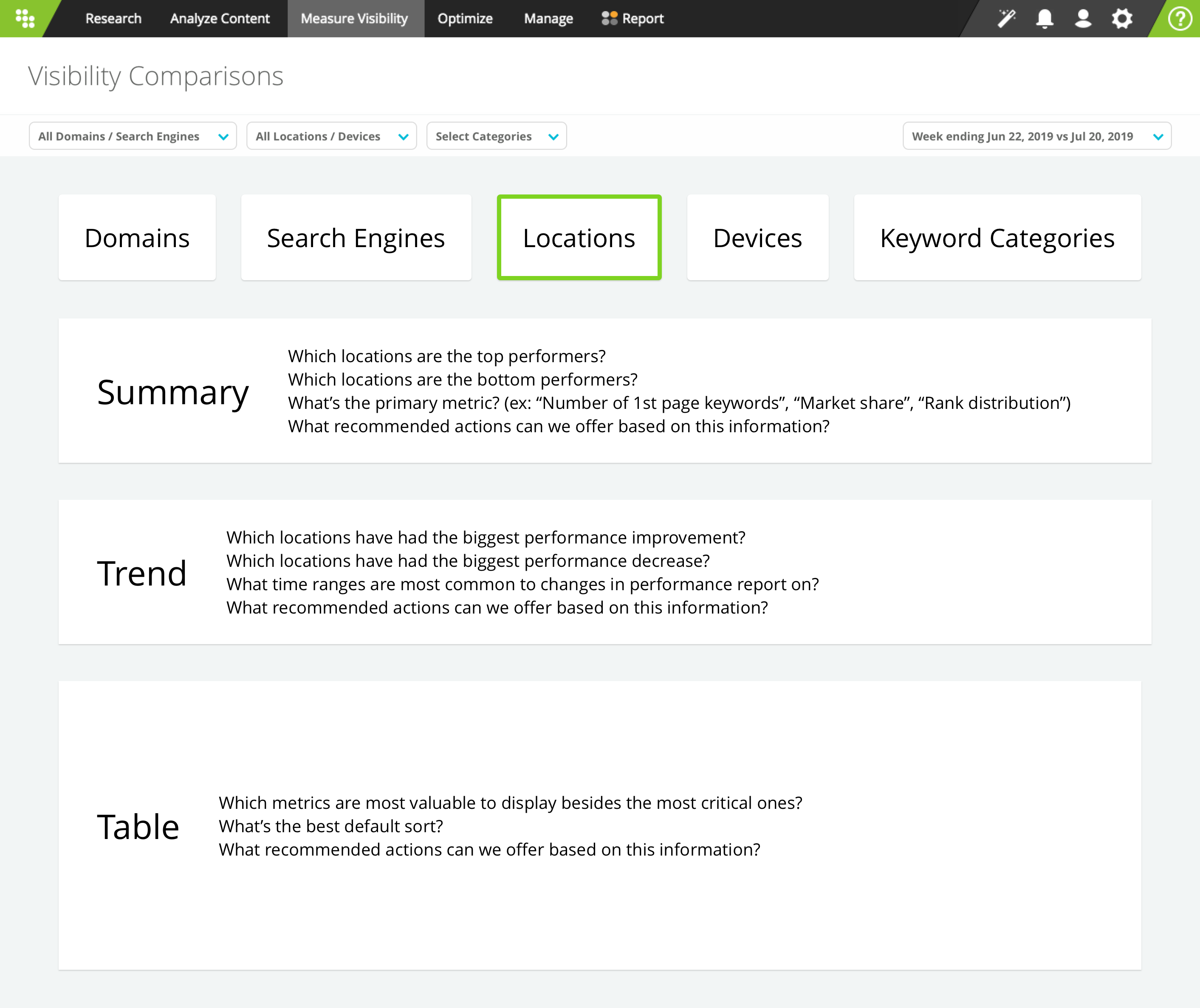
2) We create a visibility comparisons feature, which would allow users to apply various contextual lenses on their keywords to surface summary level insights about which contexts to prioritize their efforts on.
Tools used:
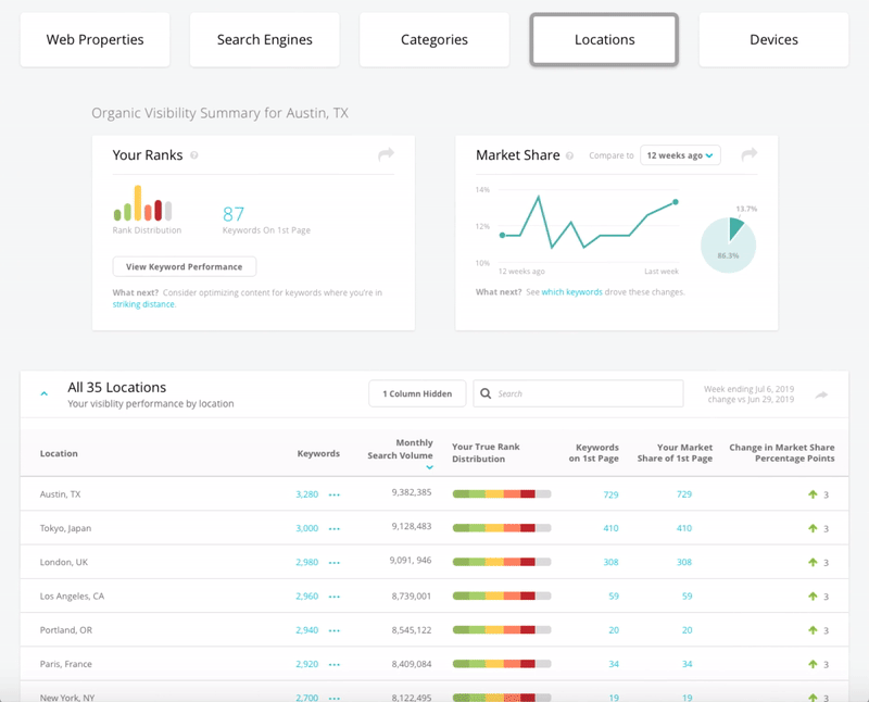
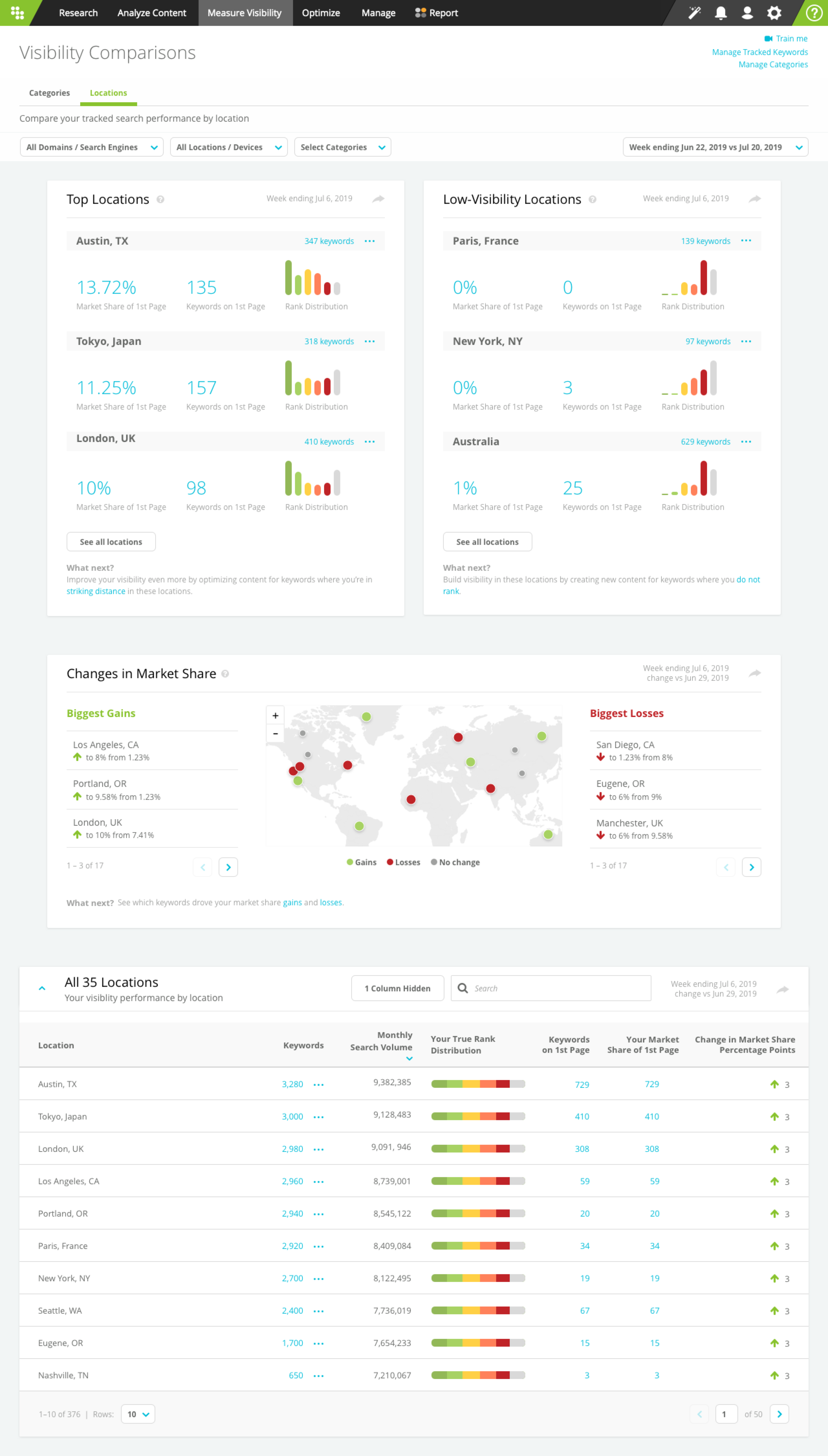
After reviewing product feedback, we noted that our users vocalized a need to better understand their website visibility and optimization priorities based on location. Location is one of the most important reporting attributes for enterprise customers. Their websites receive millions of visitors from a variety of locations and they spend a great deal of effort optimizing their website content based on each one.
This spurred several rounds of design concepts and feedback sessions. I experimented with reporting on various metrics (monthly search volume, number of local results, top ranking results, count of volatile keywords, market share). I also tested different data visualizations to better understand how the user would effectively process and act on this information.
Tools used:
Conducting validation with the customer service team and customers led to the following insights:
Tools used:

Thousands of brands and enterprise marketers use Conductor’s platform to manage their search visibility in search results and the performance of their web content. However, as search engines like Google evolve from ten blue links to more dynamic content, our users needed deeper insights on how they were showing up in results. For example, when and where are videos or local results appearing? As designer on this project, I set out to optimize our reporting capabilities to give marketers deeper insights around their performance.
| Timeline |
|---|
| 4 months |
| Tools |
|---|
| Zendesk, Airtable, Sketch, Gong, Axure, Pendo, and Heap |
| Activities |
|---|
| Research, Conceptual Design, Validation Testing, Detail Design, Usability Testing, Documentation, and Acceptance Testing |
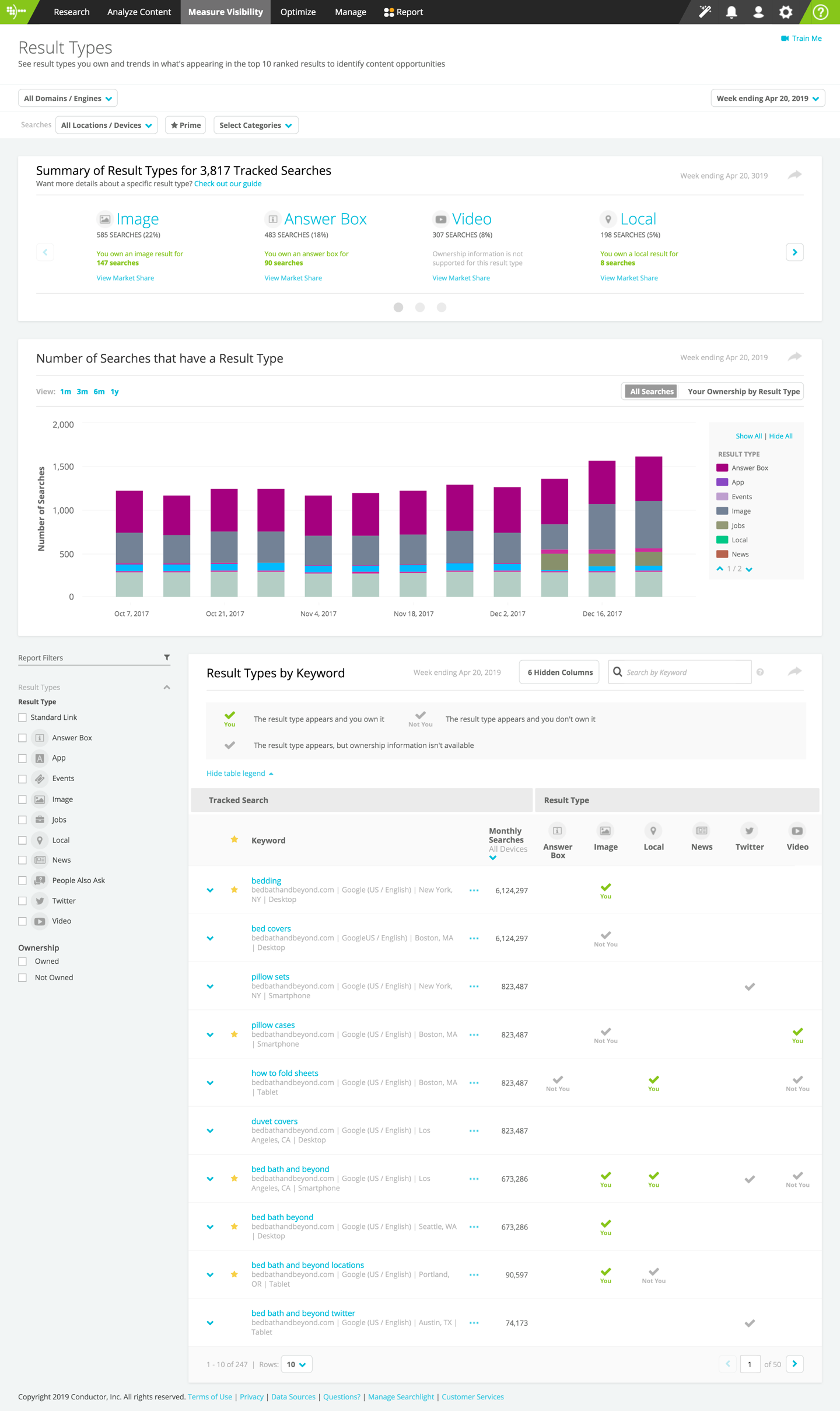
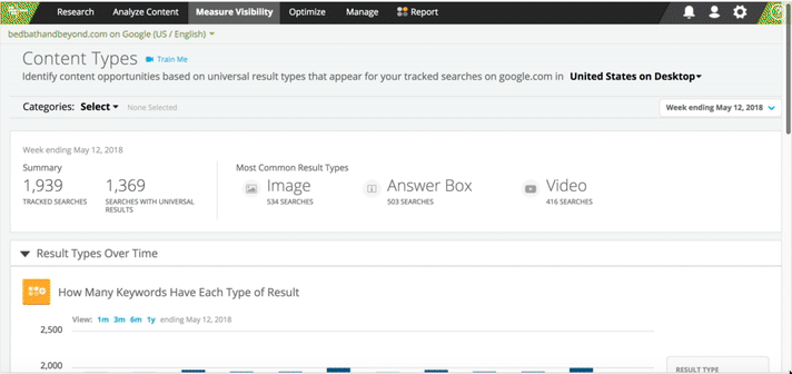
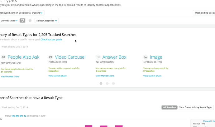
Previously known as Content Types, this feature surfaced information on how results appeared in search results. It was a good starting point, but there were data gaps (no information on result type ownership), and the design was stale.
Tools used:
Gathering and prioritizing product feedback. Understanding the layout of a search results page wasn't enough information for our users - they needed to understand where they owned various stand-out features on search results. We conducted several user inquiries and reviewed product feedback. Our findings indicated that users had four pain-points that we needed to address:
Tools used:
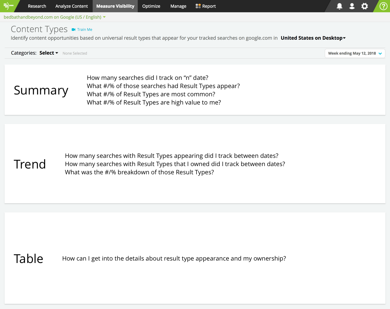
I started out by outlining what information would be most valuable to surface to users, and considered how best to build the right story. Continuing to offer summary level information, along with trending and detailed insights at a keyword level was crucial to the success of this report. I also saw an opportunity to provide additional touchpoints to drive users towards additional research and content optimization workflows.
Tools used:
Over the next month, I went through the process of iterating and soliciting feedback on design concepts. I experimented with varying our information architecture, highlighting only the highest performing result types, allowing users to focus on a single result type and trending it over time, and displaying ownership data for each result type independently (as well as comparatively for multiple result types.)
Tools used:
After several rounds of testing, my participants left me with a clear direction on enhancing this feature. We needed to make it simple to understand all result types by providing the following functionality:
Tools used:
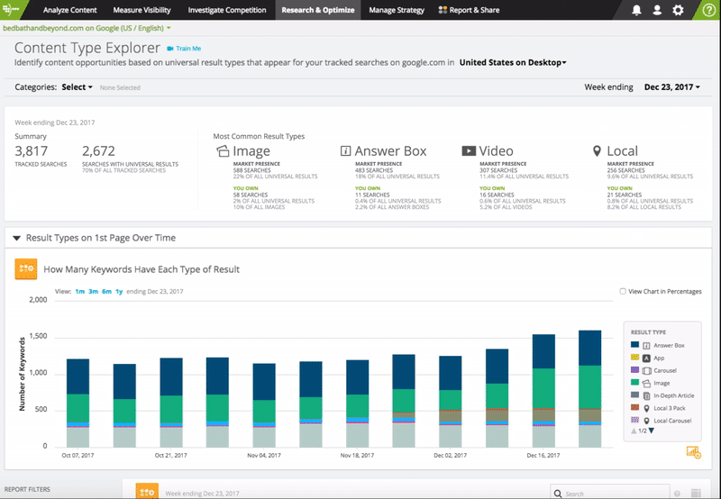
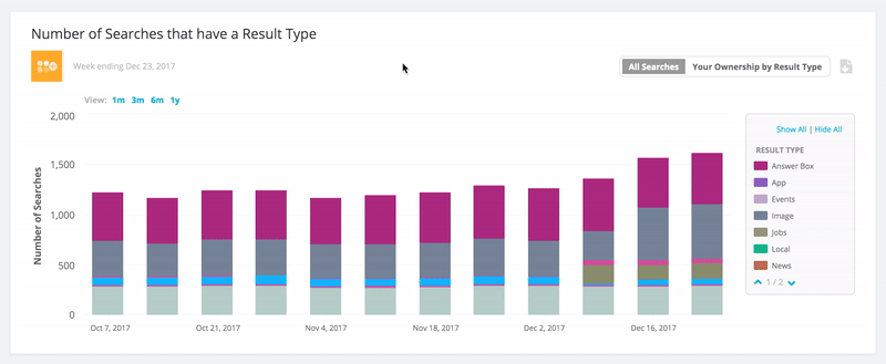
I added a summary widget to support information on all result types - gone were the days where users had limited summary information. This allowed the user to quickly glance across all result types, and immediately understand where they should prioritize their efforts. Additionally, users could now see their ownership for each result type, in a snapshot, and trended out over time. And lastly, users could now deep-dive into analysis workflows for each individual result type and link into additional reports to optimize their content and target result type opportunities.
Tools used:
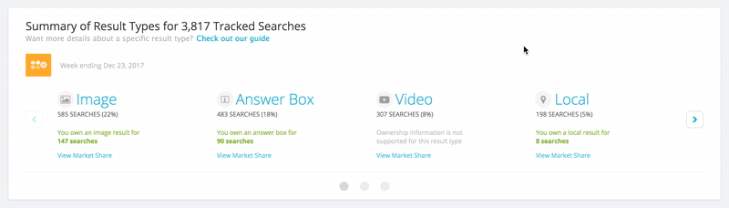
Understanding ownership trends informs users about the search landscape. For businesses interested in educating their customers - this report could now help them determine what kinds of content their known competitors were creating. In doing so, they could fine tune their marketing efforts to create better targeted educational content, increasing the likelihood of them appearing at the top of the search page. Incorporating a view to focus on individual result types to see how result type ownership changes was vital.
Tools used:
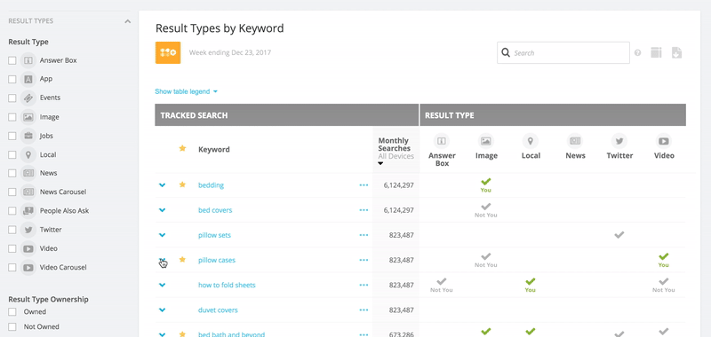
The table widget was updated to support those users that needed to see appearance and their ownership of result types. Additionally, users could now view contextual details about each keyword - like top rankers, and whether competitors owned any results. And lastly, users could now drill into the Keyword Details and Page Insights features, closing the loop on their execution workflows.
Tools used:
For those users that need some additional information on result types, I wanted to bring our knowledge base to the forefront. I coded a custom a set of contextually accessible educational guides - supporting our less seasoned users to maximize the value of this feature.
Tools used:
After a successful beta and eventual GA release, this feature saw a jump in user engagement by approximately 100%. Today, this feature is frequently used by the majority of our users.
Check out the feature highlight on Conductor's blog
Understanding the search landscape and the level of content visibility therein is a difficult process. Search is constantly evolving, new mechanisms are being implemented at incredible speeds, and the search results page is a dynamic, often difficult to define space. My goal was to ensure that our users could not only understand its layout, but get deeper insights into how they appear there. Search results essentially reflect what the best answer is to a posited question.
What I have learned is that by educating users in context, providing the right fidelity of information to support their research needs, and helping them execute on their optimization goals - they'll not only become more efficient, but will ultimately provide more value to their customers.