← All work

Staff Designer · Visor / Usercentrics · 2025–Present

MCP Manager

Role

Staff Designer, sole designer

Problem

Organizations had no clear way to govern AI agent access at scale

Approach

First-principles product design, internal validation, alpha customer feedback, rapid iteration

Outcome

Led design from early concept to acquisition by Usercentrics in January 2026; product is now in active use and continuing to evolve within a larger platform

Not how to use MCP — how to manage it across an organization.

As MCP emerged in early 2025, Visor saw a bigger opportunity: governance. The challenge was no longer how to use MCP, but how to manage it once multiple teams, servers, and agents were involved. Organizations needed a way to control access, track approvals, and understand what was happening across the system without slowing developers down.

I designed MCP Manager from scratch to meet that need. As the sole designer, I was responsible for defining the product from the ground up: shaping the core mental model, designing the system for both administrators and developers, and helping turn an ambiguous new category into something usable, legible, and trustworthy.

Making an invisible system understandable.

The hardest part was not technical complexity — it was making an invisible system understandable.

MCP infrastructure is abstract. Servers, gateways, agents, permissions, and policies all interact in ways that are difficult to see from the surface. Before users could configure anything confidently, they needed a clear mental model of how the system worked.

That shaped the product from the start. The first job was to make the structure legible.

A system people could understand, navigate, and trust.

A system people could understand

I defined the core product model around the main entities in the system:

This structure gave administrators a way to reason about the system without forcing developers into unnecessary complexity.

MCP Manager welcome screen showing entity relationship diagram of AI apps, gateways, MCP servers, and users

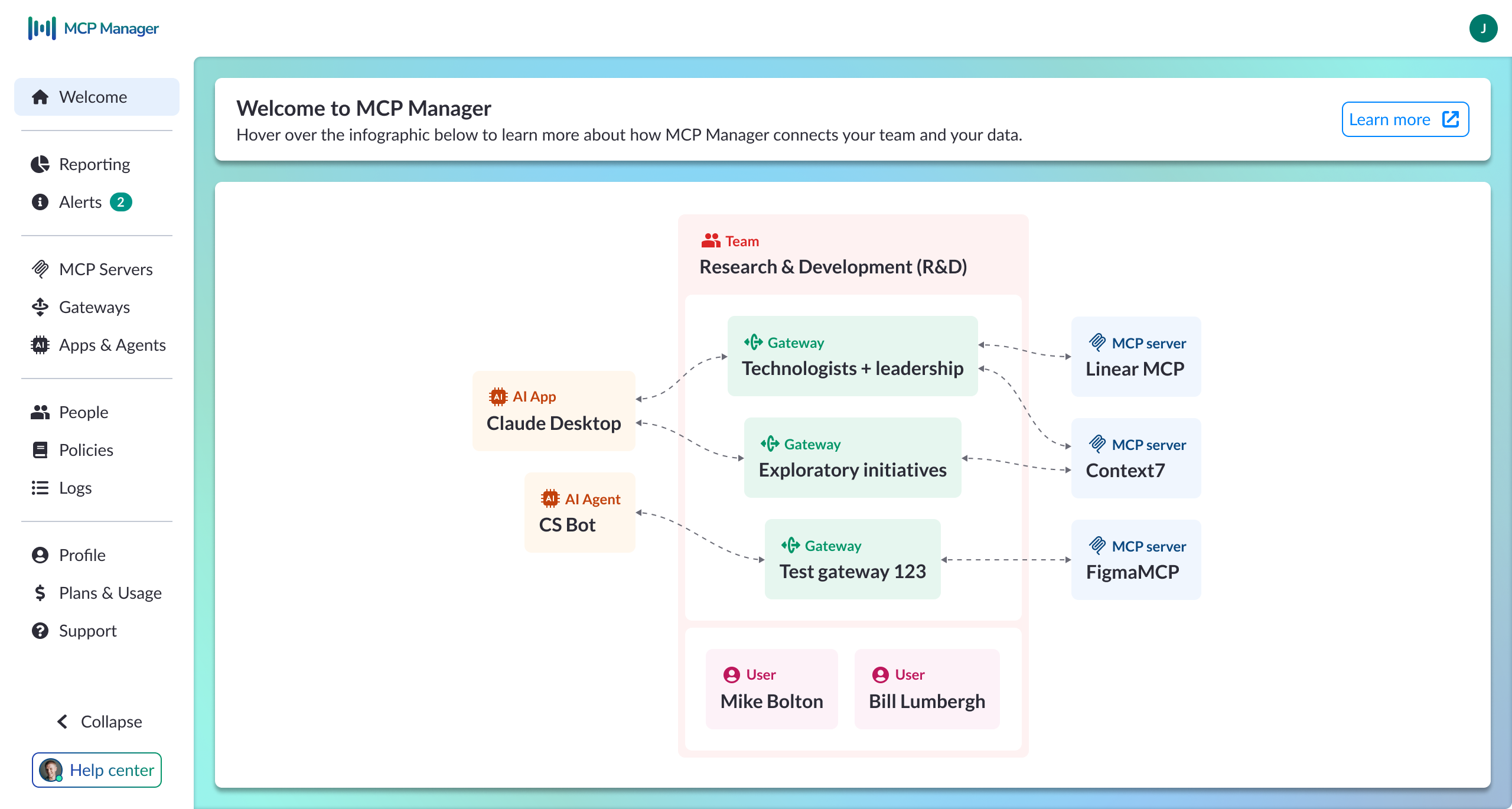
Welcome screen — system model overview

Information architecture built around two user needs

The navigation reflected the tension between speed and control. I organized the product into four layers:

This made the product easier to navigate without splitting it into separate admin and developer experiences.

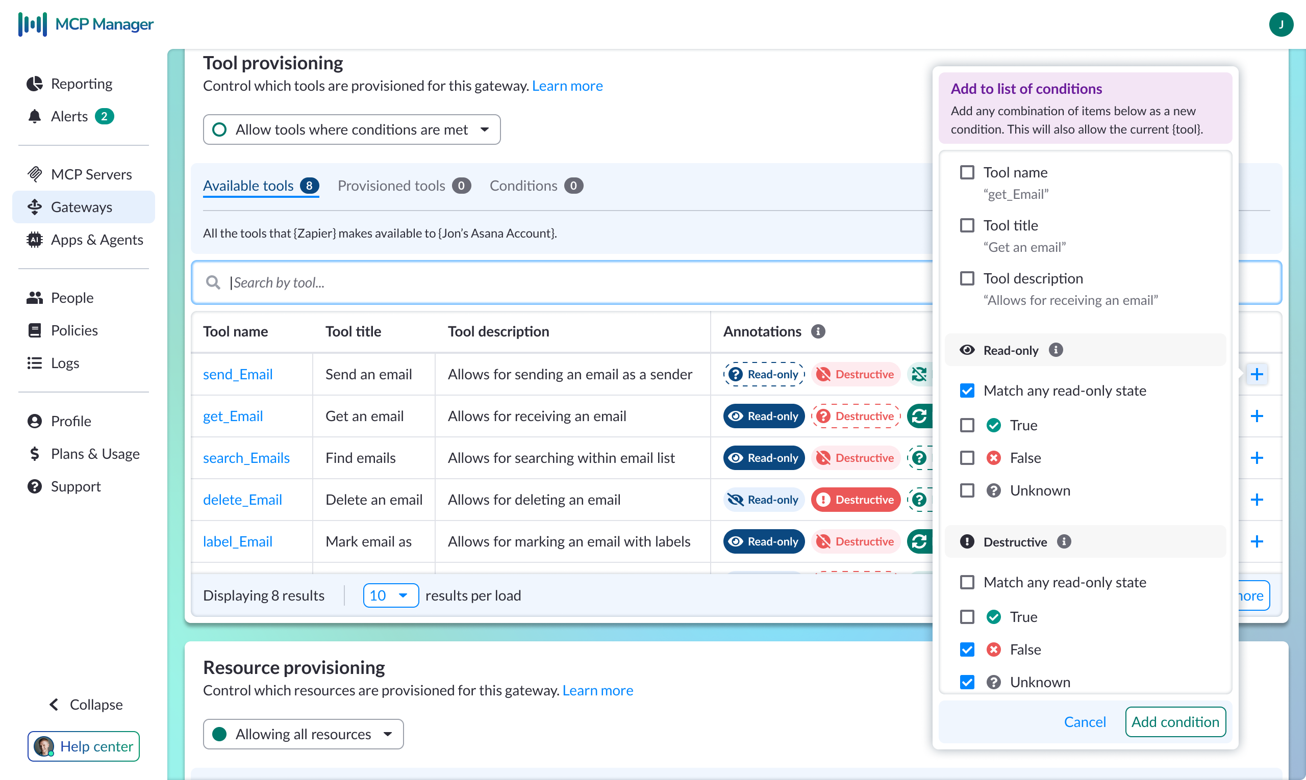
A clearer model for gateways

One of the most important product decisions was how to represent gateways.

A gateway is valuable because it makes complexity disappear for developers. An app connects once and can then access multiple MCP servers through a single layer of orchestration. The developer does not need to configure every connection individually or even know which systems were involved.

That meant the UI had to communicate two truths at once: administrators need to understand and control this layer, and developers should barely have to think about it.

Gateway configuration screen showing connection URL, assigned MCP servers, team access, and audit history

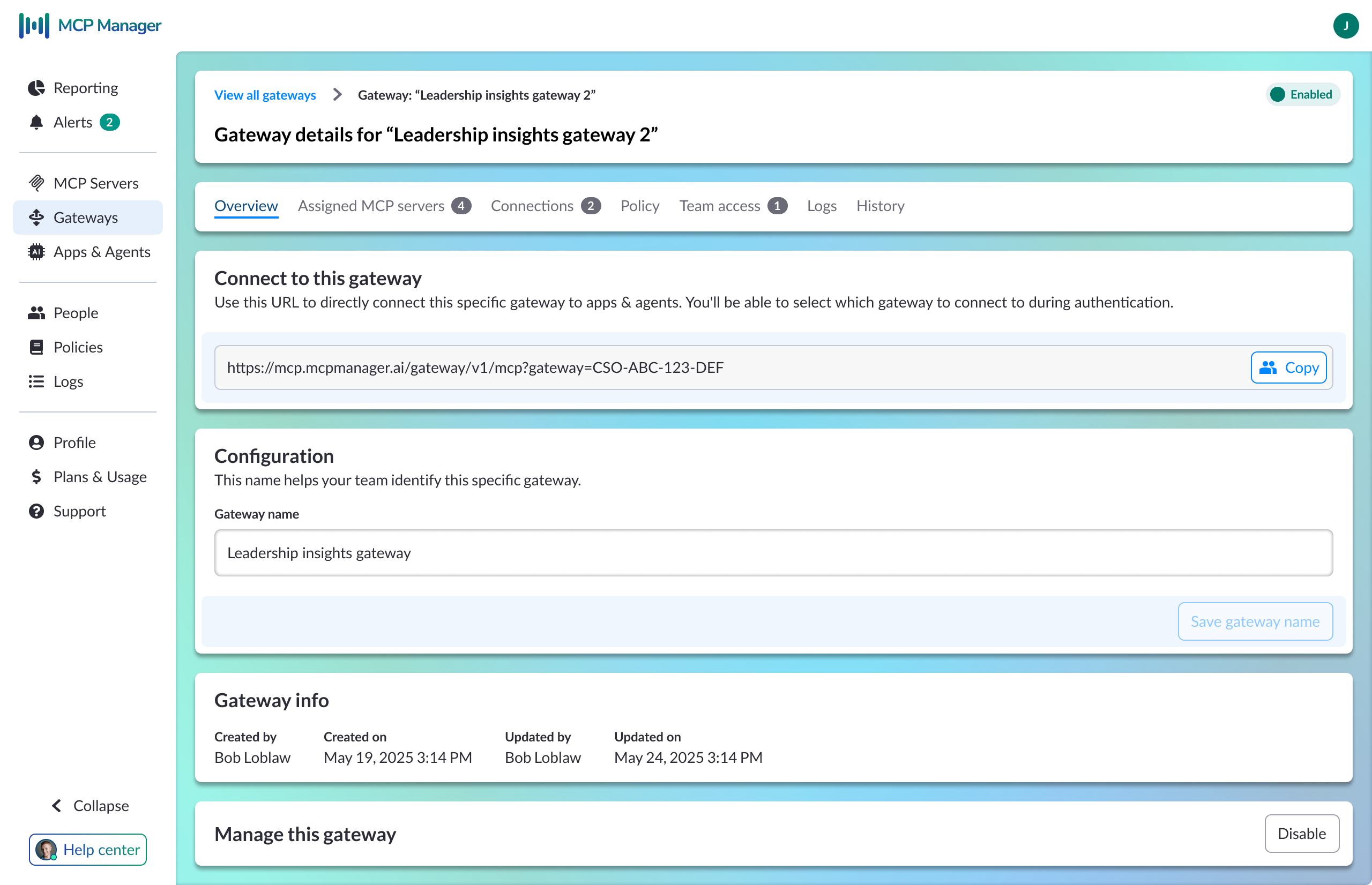
Gateway configuration — connection URL, assigned servers, team access, and logs

A workable model for local connections

Local MCP servers require tunnels, which can easily become messy in the UI.

To simplify this, I introduced a grouping construct that ties a tunnel to a user's machine rather than a specific server. Only one MCP server is active through that connection at a time. This reduced a potentially unmanageable set of states into something users could actually understand and configure.

Extending an existing design system to cover new territory.

MCP Manager was built on top of the existing Visor component library. That let us move quickly without rebuilding the system from scratch.

I extended the existing token and component architecture to support new MCP-specific patterns as the product matured.

Component work that unlocked product capability

A good example is the annotation chip system.

Tool annotations needed to communicate three distinct states: known true, known false, and unknown. This was not just a visual distinction. Each state changed how an administrator would interpret a tool's behavior and risk.

That same work later supported a more advanced condition builder. What began as simple attribute matching evolved into annotation-aware governance, where admins could create rules like "allow tools where Destructive is false" instead of relying only on name-based matching. This shifted the product from basic filtering toward semantic governance.

Annotation-aware condition builder showing tool provisioning table with Read-only, Destructive annotations and a condition popover with true/false/unknown states

Annotation-aware condition builder — semantic governance by annotation state

Navigation patterns for a growing product

As the configuration model became deeper, I introduced a breadcrumb and page-header pattern to support gateway-scoped views and deeper admin workflows. That pattern became the standard navigation model for more complex configuration paths.

Four phases in under a year.

The product changed quickly as the category became clearer.

A representative example is the condition builder. In Phase 1, conditions were mostly attribute-based and acted as a simple provisioning gate. By Phase 3, the same workflow supported annotation-aware matching, letting administrators govern tool access based on semantic risk signals instead of labels alone.

That evolution shows how the product matured from a basic management layer into a more expressive governance system.

Acquired by Usercentrics. Still evolving.

MCP Manager was acquired by Usercentrics in January 2026. I continued with the product as Staff Designer, expanding my role to include design operations and team integration alongside core product work.

The work is still ongoing. The MCP ecosystem is young, conventions are still forming, and the product continues to evolve as customer needs become clearer.

Current work includes:

Also see

Visor: View Orientation

A self-initiated product redesign that started as a simple orientation layer and grew into a broader shift in product structure and navigation. 4x increase in sign-up conversion and workspace invitations.

Read Visor case study →